After a brief hiatus because of my visit to NYC for my
brother’s wedding, I’m back with another beautiful art lesson to show off. This
week students continued to focus on color, refreshing their memories about the
primary colors, secondary colors, and the monochromatic color scheme and adding
in a new element that artists use to create dramatic compositions: the warm and
cool color groups. Students used the knowledge they have gained about
composition, line, and positive and negative space to play with the warm and
cool color groups and reinforce their gaining sense of how colors work
together.
Check out the wonderful products of their experimentation!:
 |
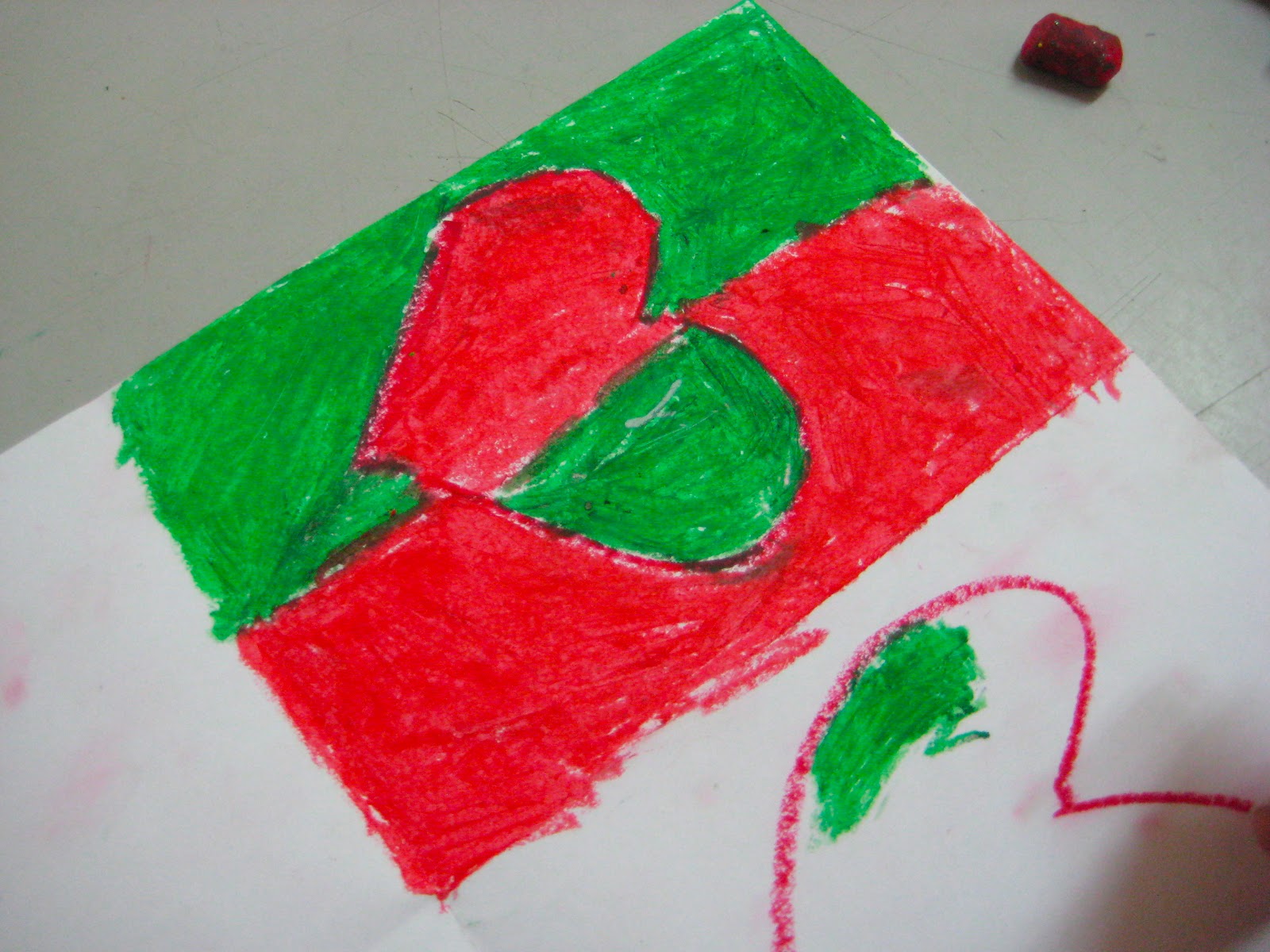
| Beginning with line |
First, we drew all sorts of lines all over the
page in all different directions. Next, we chose an object to represent and drew it big in the center of the paper.
 |
| Grouping our colors |
 |
| Finished with the cools, now onto the warms! |
 |
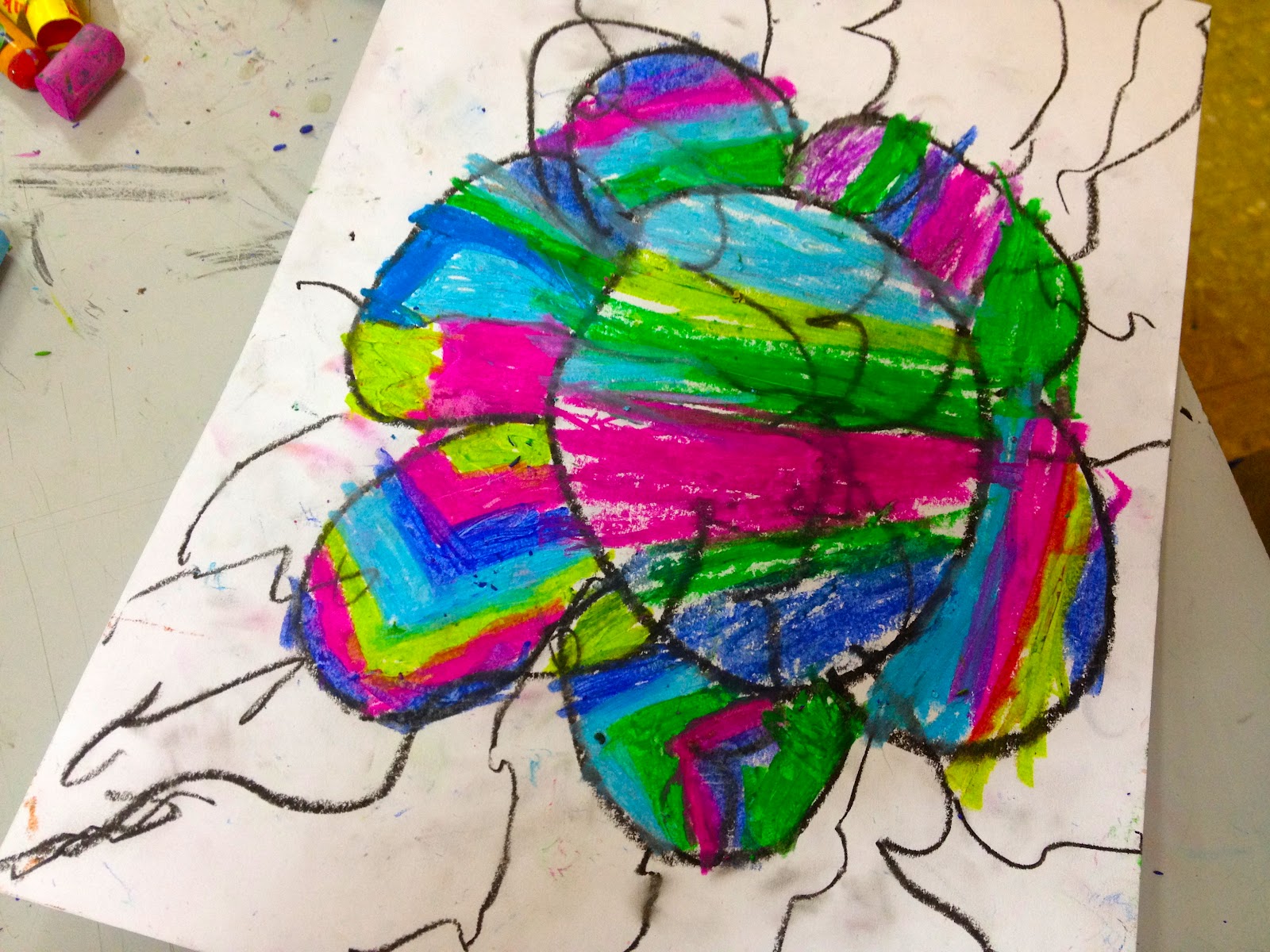
| Experimenting with color groups with the aid of the color wheel |
Then, we sorted our colors into two groups, remembering that warm colors
remind us of fire (reds, oranges, yellows and everything in between) and the
cool colors remind us of the sea (blues, greens, and purples).
Students remembered that there isn’t just one
hue of each color and were able to group pink into an interesting category that
skates along the border of warm and cool and settled on grouping it with the
cool colors, and firmly placed aquamarine in with the cools as well. There was
some debate about peach until one student proved that it is a monochrome of
orange mixed with white. I was so impressed by the high level of art talk
floating around the room by these now seasoned artists!
We had a ball creating our compositions and realizing the power of
grouping colors into warm and cool. Just look at how our artwork popped
because of it!