Pop Art and Complementary Colors
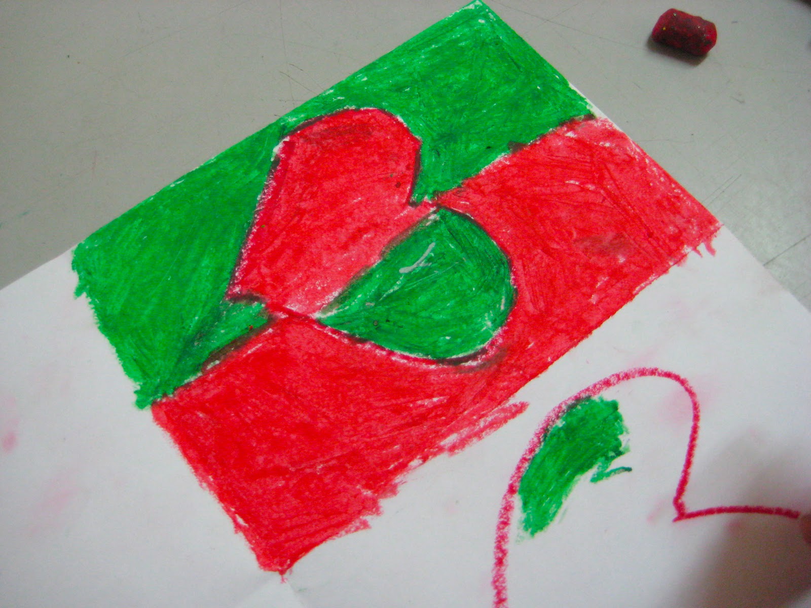
During our last lesson on color, students learned about Andy Warhol and how he used complementary colors, those that are opposite one another on the color wheel and when used against each other, highlight one another, causing the colors to 'pop.' Then, after a brief discussion about the influence of Warhol's works on popular culture and a testing out of different pairs of colors, students were able to determine that the pairs that work best are red and green, yellow and purple, and blue and orange. They put their newfound knowledge to the test and created beautiful, vivid works of art!
 |
| Sketching out a design |
 |
| One of the finished pieces |
 |
| Testing out colors that complement one another |
 |
| A finished creation |


No comments:
Post a Comment